What is architectural lettering? In simplest terms, it is the display of your corporate persona with three-dimensional shapes. Our North County sign shop installs architectural lettering for a broad range of clients.
Make the Wall’s Background Work to Your Advantage
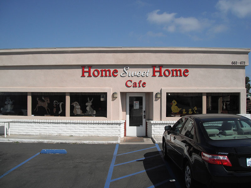
When you think about featuring your corporate persona with 3D letters, the solid background color of the wall they will be mounted on is a great asset. With a perfectly selected color contrast, examples might include red or white on a light beige background; your architectural letters are easy to see.
Choose the Right Material
The average 3D letter is between one-quarter and one inch in depth. While this might not sound like much, it can make a tremendous impression on the consumer approaching your location. The trick is to select the right material for the project so that the display encapsulates your brand message and features a texture – or not – that creates a wow factor.
Examples include outdoor-rated foam, stainless steel, Cor-Ten steel, aluminum, fabricated plastic, and flat-cut acrylic. Acrylic is a hands-down favorite in North County because of its stylish look and matte or glossy finish options.
Pick a Display Color That Meets Your Purpose
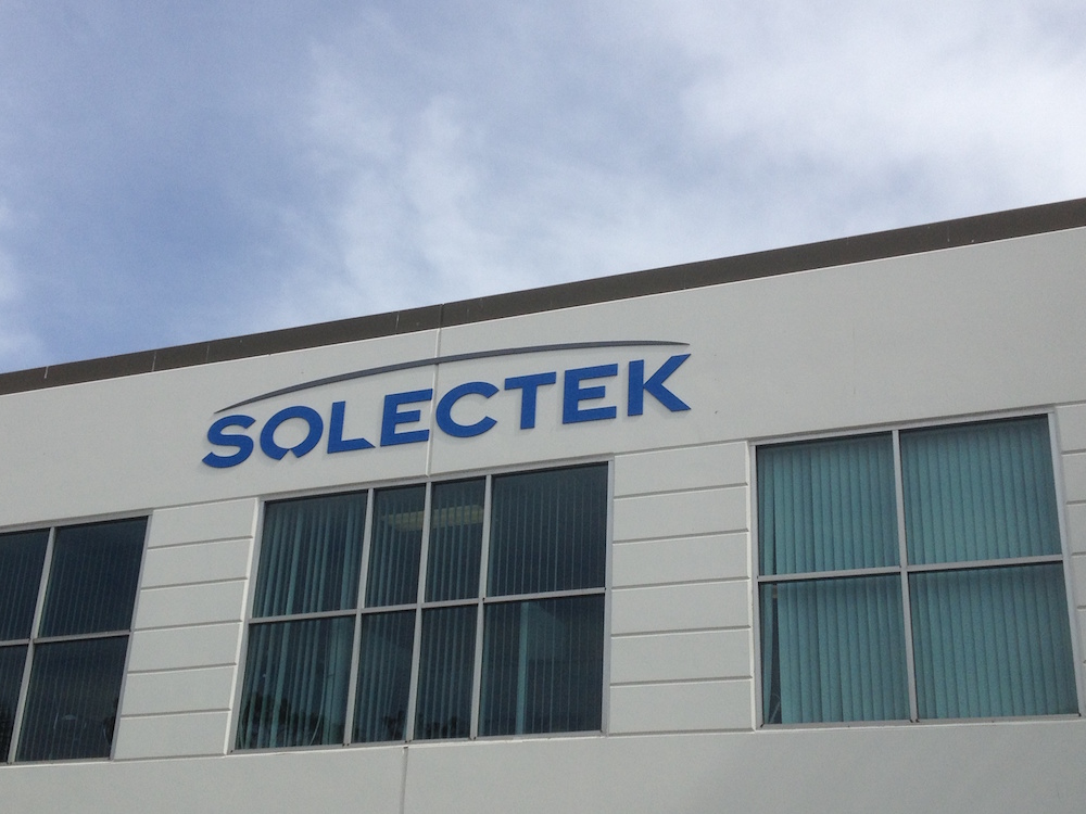
The majority of business owners request the use of the corporate color palette. It means that the building sign will look precisely like the name and logo display on the company’s website, sales collateral, and similar places. However, it is not your only choice.
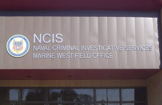
- Metal color. Some companies invest in metal letters for their facades. Rather than have us paint them in a brand color, they opt to keep the great look of the metallic exterior in place.
- White or black. A black or white option is a good choice when you are looking for a way to contrast the letters against a textured or multi-colored backdrop. The color contrast leads to a boost in the letters’ three-dimensional visual appeal.
- Contrast color. Another option is the use of a direct contrast color that nevertheless complements the hue of the wall. Taking this step is rarer, but it appeals to businesses with an artistic product or service.
Decide on the Installation Method
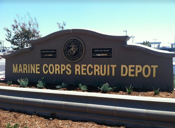
Our North County sign shop installs architectural lettering with flat mounts. It is by far the most sought-after installation option. You see it on monument signs and building facades. However, it is not the only option.
Another installation method involves pin mounts. They can be a good choice when you want to have a little space between wall and letter. In some cases, the extra space creates an attractive shadow cast that looks chic on the wall. One more reason for this mounting method is the creation of motion that we can achieve by making slight adjustments to the lengths of the pins.
With so many options open to you, it can get confusing. Our sign shop welcomes the opportunity to offer you input, show you product samples, and present you a mock-up of what your corporate persona in architectural letters could look like. Contact us today to schedule a design consultation!