Getting the right sign for your company can be as simple as understanding how color works. Rather than looking at the whole picture first, figuring out what the smaller details are communicating about your brand can inspire the rest of the sign. Before choosing the right colors to communicate to your potential customer base, it makes good sense to understand colors as a concept.
For instance, there are different types of color and ways to use the same color in inventive ways. A primary or secondary color might work better for you when using a hue or tint to accent or contrast an otherwise two-dimensional piece.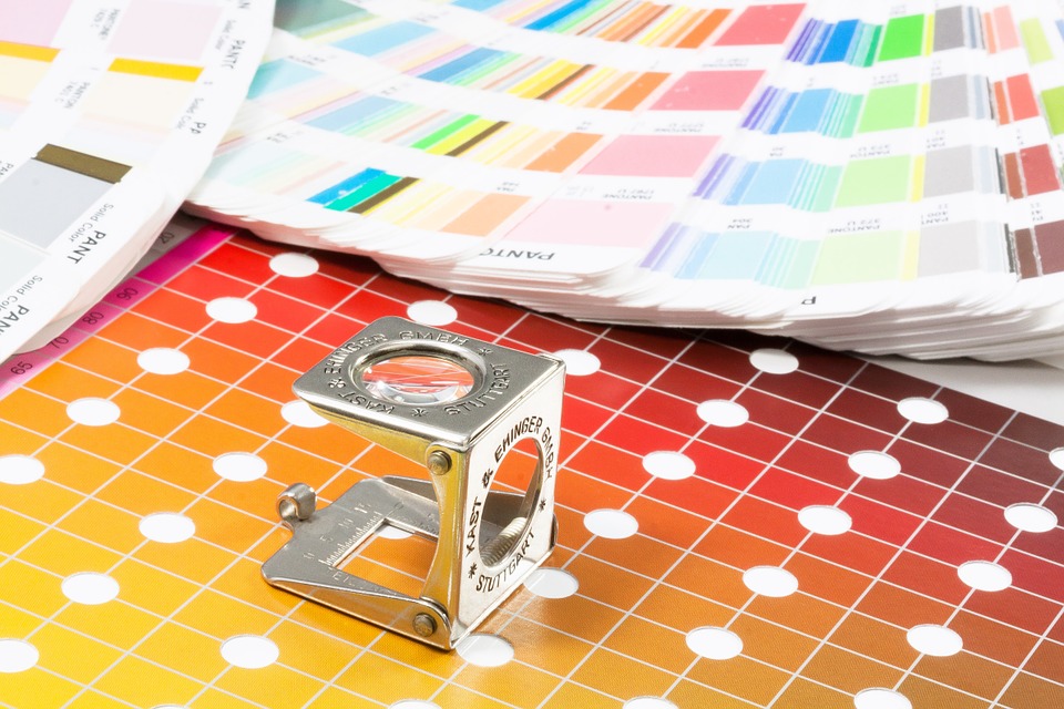
Primary Colors
A primary color is simply a color you cannot create by adding colors together. There are three primary colors: red, blue and yellow. Combining these three colors is how painters create the colors they need, in most cases. Adding a small amount of red to blue creates red-violet, and adding a small amount of blue to red makes blue-violet. While the two colors have the same primary colors creating them, it has a big impact on how they are perceived. The red-violet will come off warmer while the blue-violet has a cooler, calming effect.
Secondary Colors
Secondary colors use the primary colors in their creation. The main three secondary colors are green, violet and orange. These colors are often used to create contrast and interest in a sign, as they can be paired against their complement. For instance, orange is the complement of blue. In some cases, too much contrast can be overwhelming but using them wisely can make a dynamic sign, sure to stand out.
Tertiary Colors
Blue-violet and red-violet fall under the umbrella of tertiary colors, along with yellow-green, blue-green, red-orange and yellow-orange. These are made by mixing the adjacent primary and secondary colors most often, but can also be created as described above. This can add a bit of contrast without overwhelming the eye. For instance, a yellow-orange will stand out next to blue in a more subtle way.
Adding a tint, tone or shade can also help create contrast without hurting the eye. A tint is a hue mixed with white, a tone is a hue mixed with gray, and shade is a hue mixed with black. Depending on the vision for the sign, these can mute the brightness of a hue while still adding contrast.
Ready to get started? Contact us today and tell us the next project you are working on for more information.